Musgo

Musgo is a shop of everyday objects with character and soul, located in the Americana neighborhood in Guadalajara. The project consisted of developing a visual identity that reflected the sensibility of the space: something natural, close, crafted by hand and with heart. The brand needed to convey a sense of permanence, rootedness, and warmth, while also expressing a contemporary and carefully considered curation.

Concept

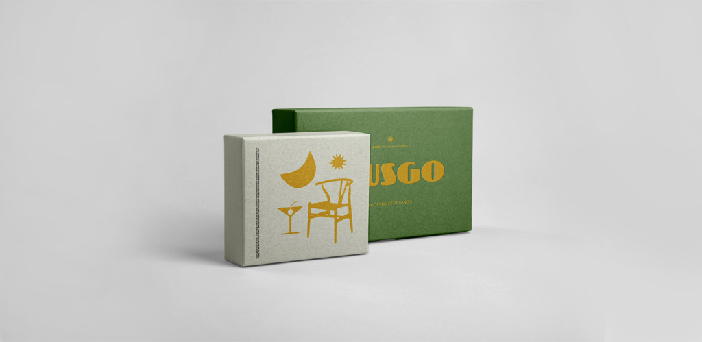
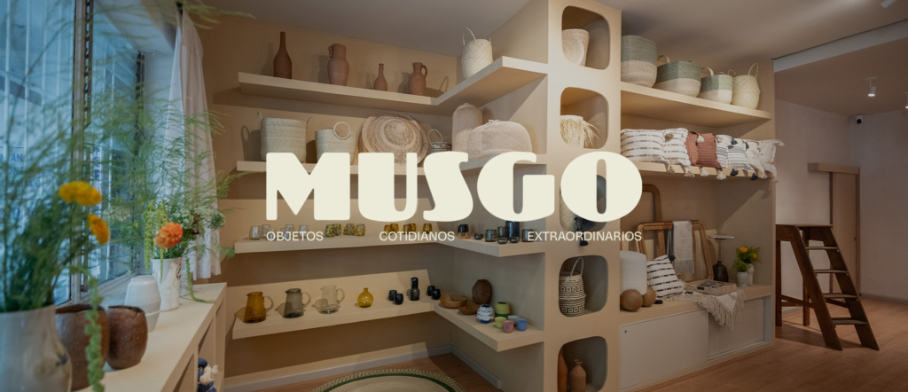
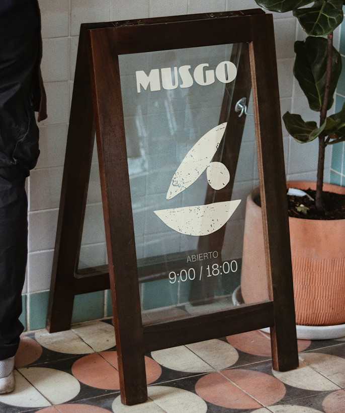
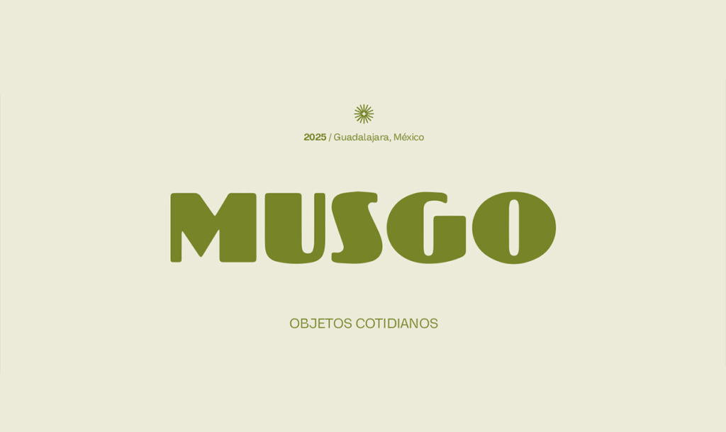
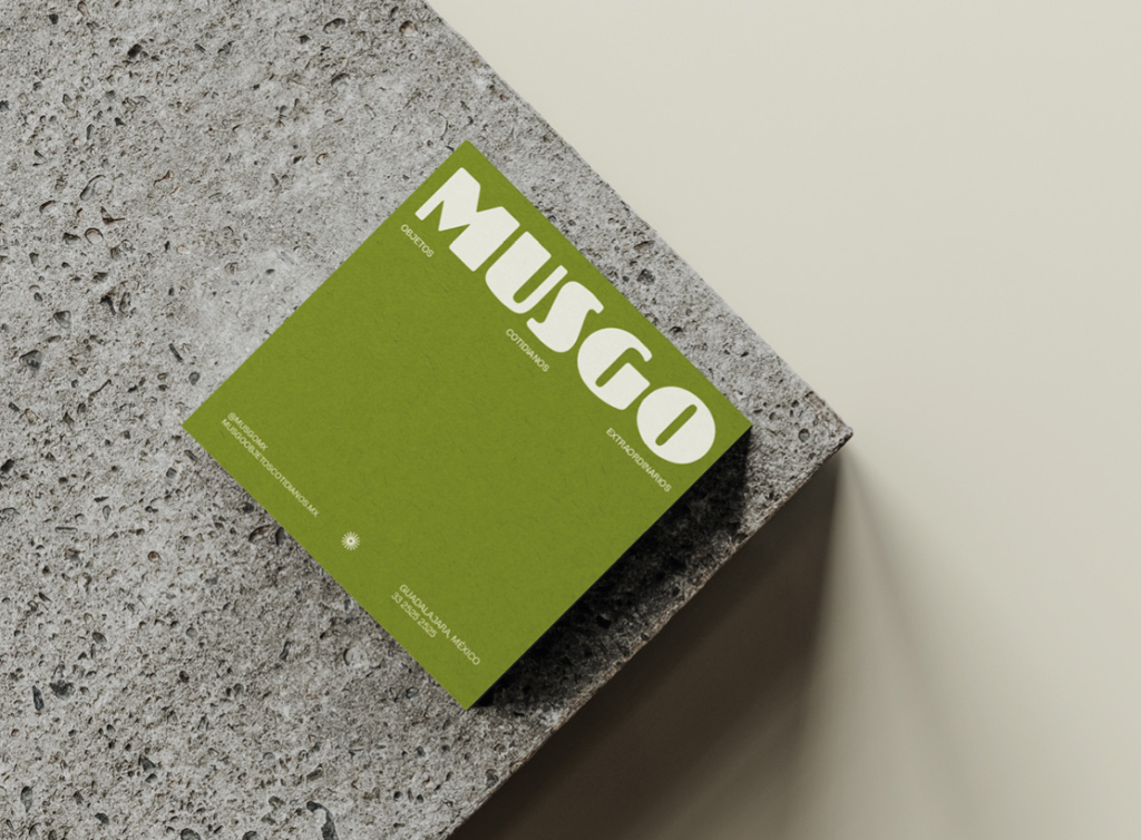
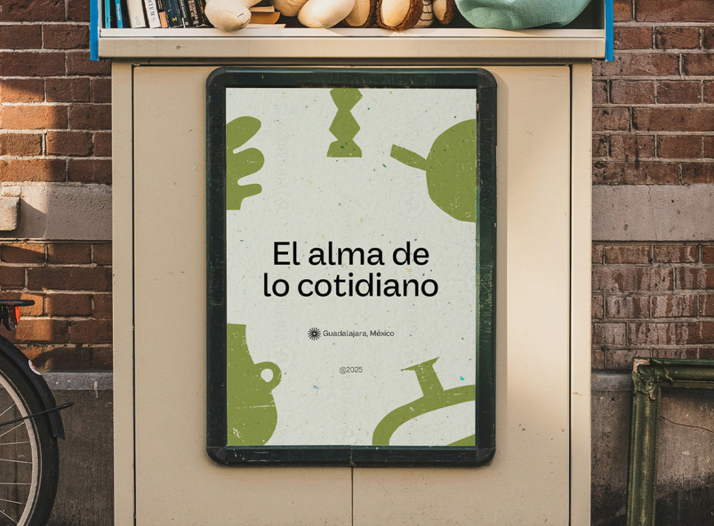
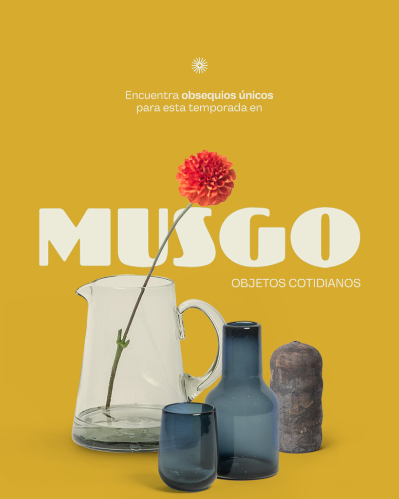
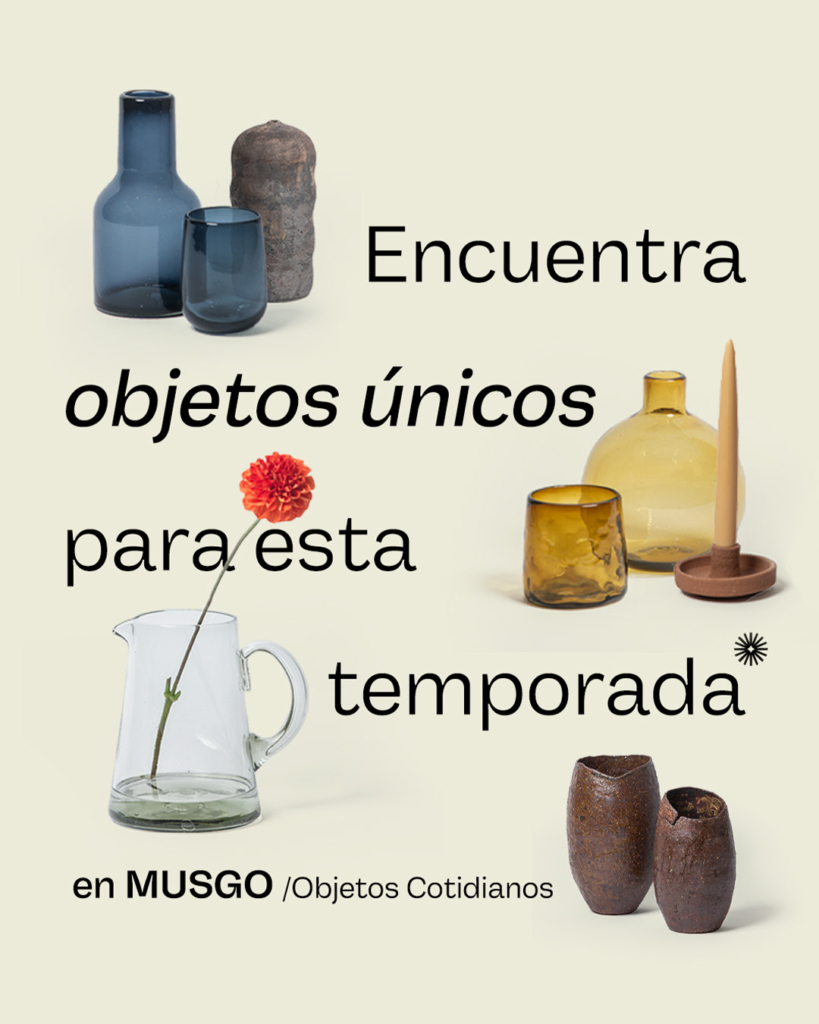
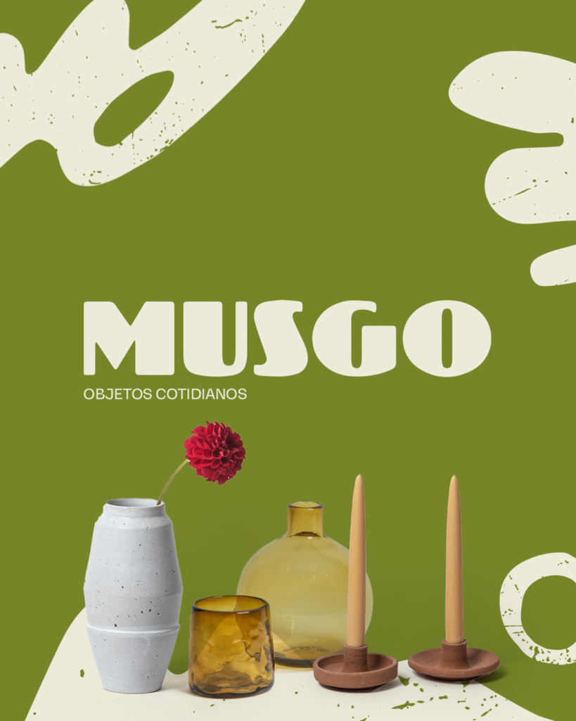
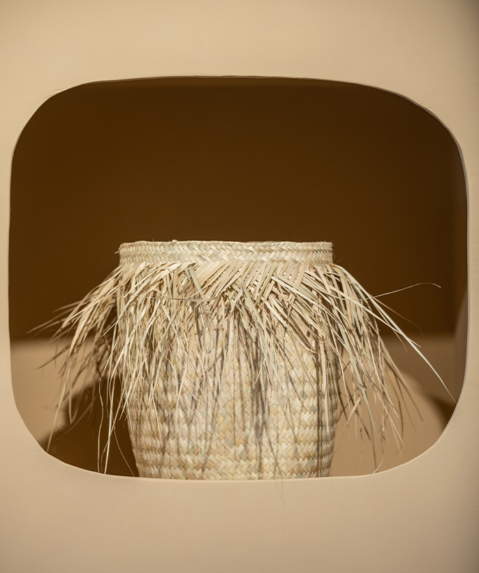
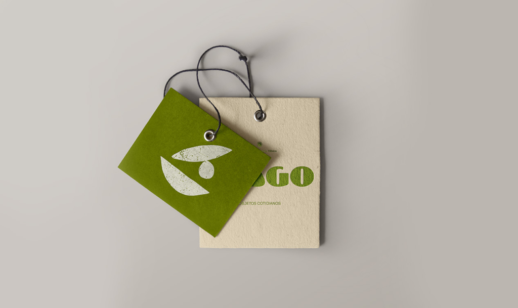
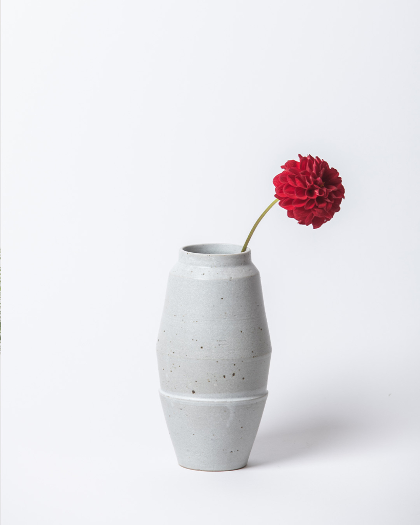
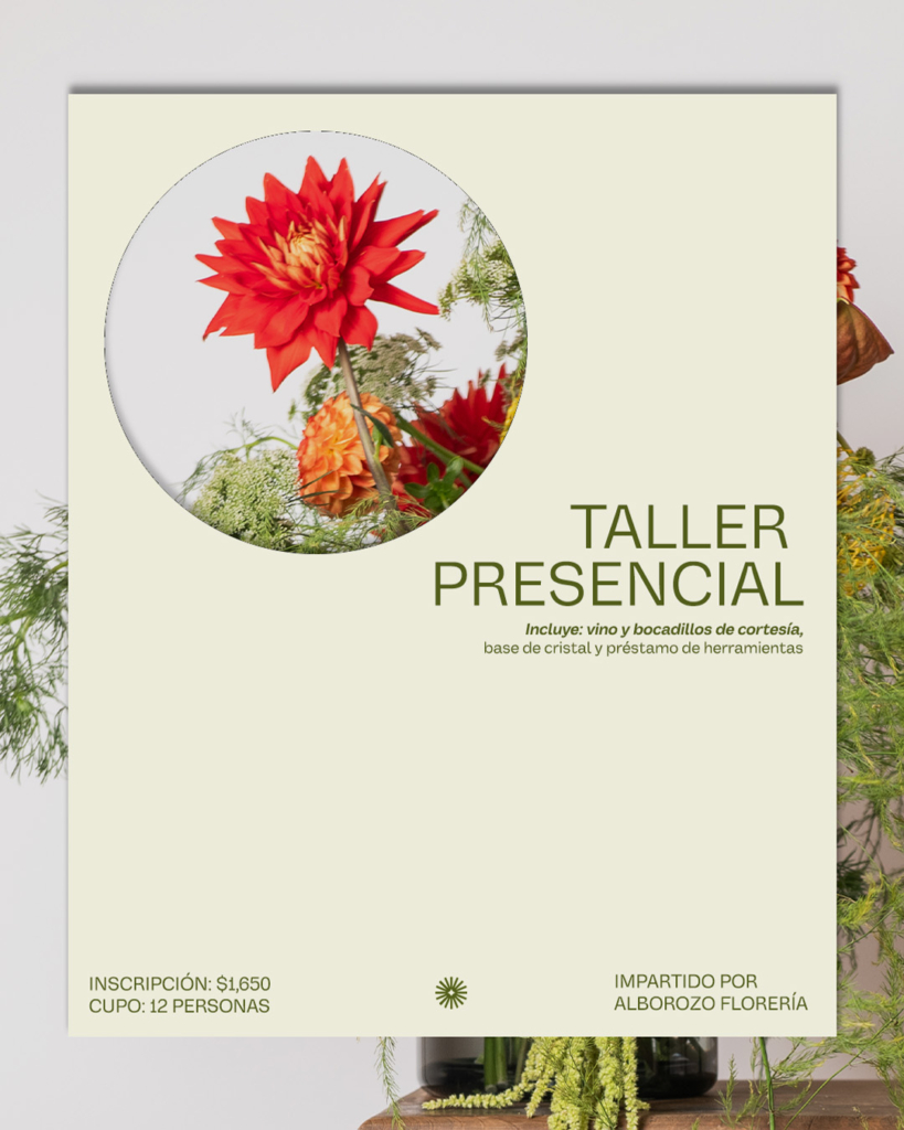
The name Musgo immediately evokes life, growth, moisture, permanence, and naturalness. Based on this idea, I developed a visual system that speaks to those notions: an organic and understated typography that conveys both warmth and elegance; a color palette inspired by humid natural environments, with green, neutral, and earthy tones; and a clean, flexible composition designed to coexist naturally with both raw materials and product or interior photography.

The goal was to build a timeless and sensorial identity that could live comfortably in both digital spaces and the physical atmosphere of the store.


Logotype

I designed a logotype with clean lines and an organic typographic rhythm. The form and spacing are intended to convey calm, breathing room, and a sense of “being at home.”

The logo is not meant to be an imposing symbol, but rather a presence that accompanies both the object and the space. It is a mark that adapts and settles gently, much like moss rests upon stone or wood.

Color
Palette

The color palette was built from earthy and natural tones, inspired by the materials and elements that shape everyday spaces: soft, slightly muted greens that evoke shade and humidity; clay and ocher hues that recall the tactile quality of soil and handmade surfaces; and warm neutrals that provide balance and calm.

The intention was to create a sensorial and restrained atmosphere, where the colors do not dominate but rather accompany, allowing each object to breathe and tell its own story within the whole.

Applications

I developed pieces for both the brand’s communication and its physical experience, including business cards, product labels, interior signage, social media assets, and editorial graphics focused on storytelling.

The identity was designed to coexist with a diverse and unique range of objects, so the visual system is flexible and unobtrusive, able to adapt to different materials, surfaces, and scales without losing coherence or presence.

Brand Language and Voice

The communication is built around the poetry of everyday life, valuing small rituals, the objects that accompany us, and the intimate gestures that sustain life. The verbal language is expressed through phrases such as “Object with meaning,”The soul of the everyday,” and “Objects for life,” simple yet purposeful messages that remind us that the everyday can also be sacred.

error: