Artemisa

Artemisa is a café that celebrates the sweetness of everyday life. A place where time softens, flavors become ritual, and the ordinary glows a little brighter.
The identity is inspired by Artemisa as a vital force: the energy that awakens us in the morning and renews us in the afternoon.

The brand needed to convey this dual nature — calm and joy, softness and vitality.
An atmosphere that invites you to slow down, breathe, and savor.

Concept

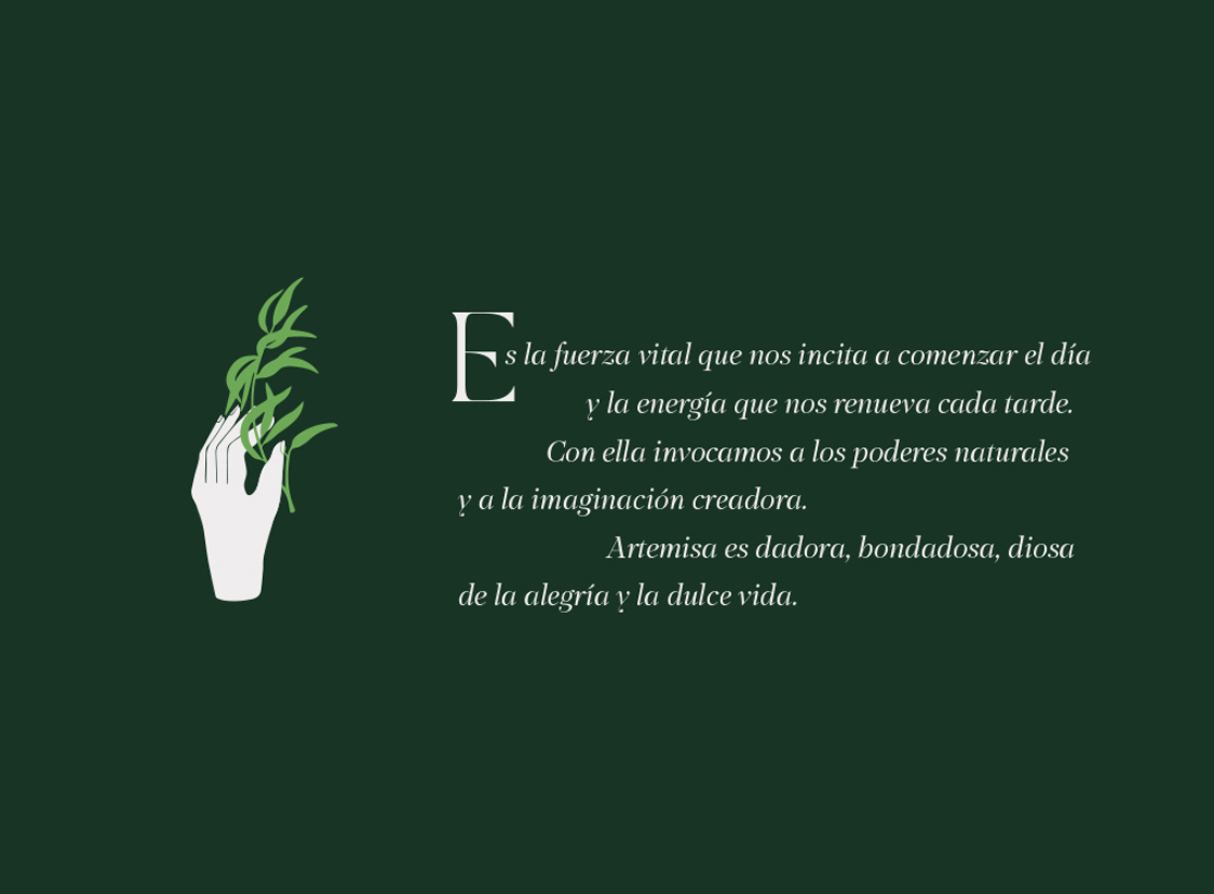
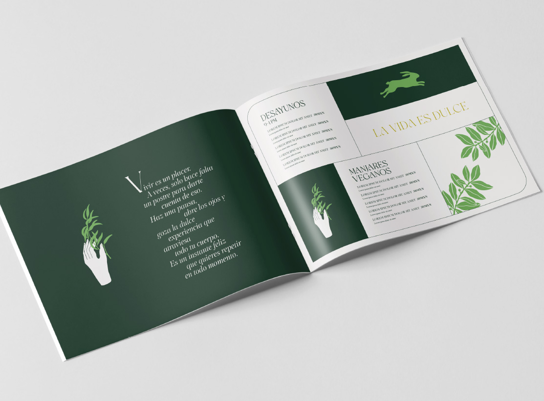
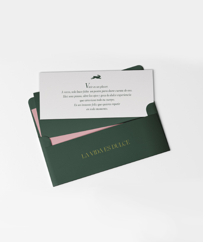
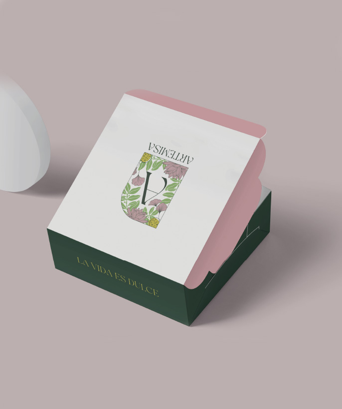
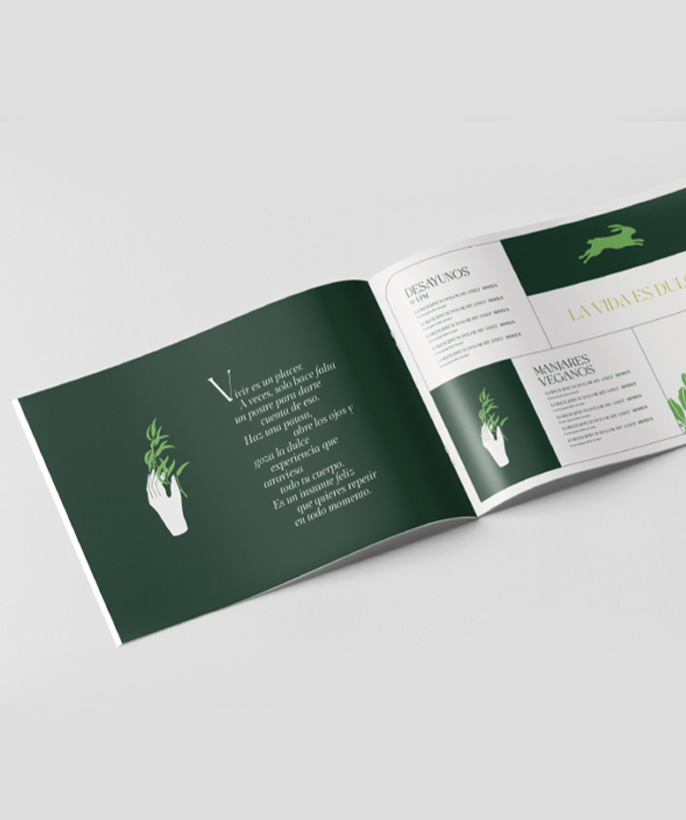
The concept is rooted in the symbolic figure of Artemisa: a giver, a protector, connected to nature and to life’s subtle pleasures.
The visual narrative evokes herbs, flowers, gentle light, and the charm of simplicity.

The brand speaks with a warm and intimate voice — a reminder that living is a pleasure, and sometimes all it takes is a pastry, a warm infusion, or a shared moment to remember it.

Logotype

The logotype holds a soft and serene presence.
Its forms are designed to convey calm, closeness, and quiet beauty.
Rather than demanding attention, it accompanies — like a signature resting lightly on paper, fabric, or ceramic.

A typographic gesture that doesn’t speak loudly — it *breathes

Color
Palette

The color palette is inspired by temperate natural tones: soft herb greens, warm creams, muted terracottas, and subtle golden accents that evoke late-afternoon light.
These colors create a gentle, enveloping atmosphere designed to support the sensory experience of the café — the textures of pastries, the warmth of ceramics, and the calm of leafy corners — without overpowering them.

Applications

The identity was applied across both physical and digital touchpoints to create a cohesive and recognizable brand experience. Menus, pastry labels, packaging, and take-away bags were designed to carry the visual language into daily interactions. Interior signage and wayfinding, as well as staff aprons and merchandise, help shape the atmosphere within the space. The identity extends to social media templates and digital campaigns, ensuring consistency across online presence. Each element is crafted to feel tactile and handmade, coexisting naturally with materials like wood, ceramics, and textiles. The use of collage and cut-out elements adds warmth and an artisanal, playful character to every piece of communication.

Brand Language and Voice

Artemisa’s voice is soft, poetic, and intimate — it celebrates small rituals and invites presence. Short, evocative lines are preferred, such as:
“Living is a pleasure.”
“A moment, a pastry, a breath.”
“Tenderness served daily.”

The tone is reassuring and sensory: it names flavors, textures and moods, and gently guides the customer into a moment of pause and delight.

error: